

Shop analytics
Revenue, orders and conversion over time — and how to read the comparison periods.
Analytics answers three questions: how much sold, what sold, and is it getting better? The third matters most, and it is answered by the comparison with the previous period.
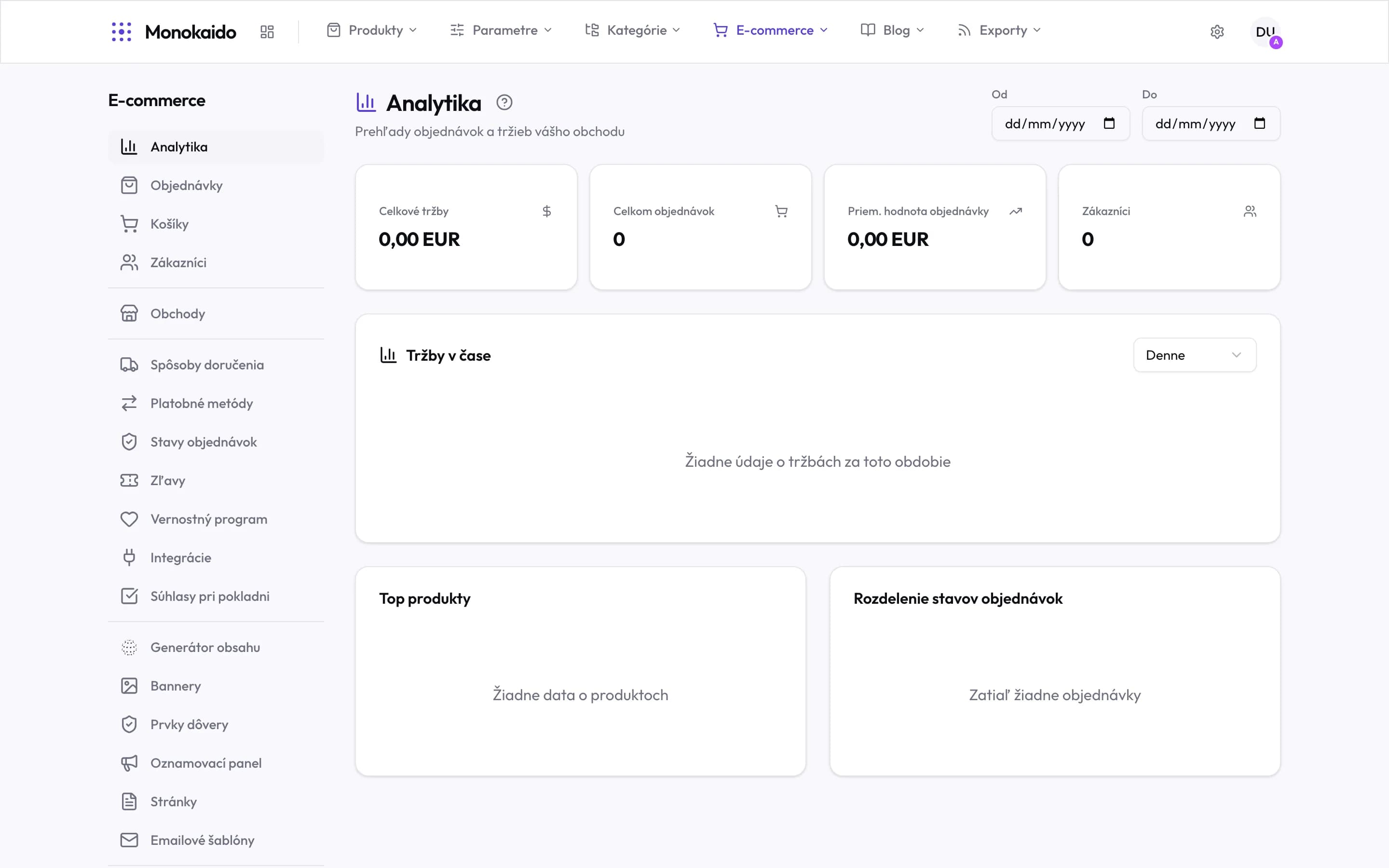
Controls on this screen
- Period — From–to. Everything on the screen counts the chosen range; empty fields mean the whole history.
- Total revenue — The sum over the period. Cancelled orders are not counted.
- Total orders — The number of orders in the period.
- Average order value — Revenue divided by count. A number worth watching over time rather than once.
- Customers — How many customers bought in the period.
- Revenue over time — The shape, not the sum. Seasonality and the effect of a campaign show up here.
- Granularity — Daily, weekly, monthly. Over a long period the daily view is unreadable.
- Top products — What actually sells — rather than what you think sells.
- Status split — Where orders are piling up. A large pending share is an operational signal.
The measures
| Field | What it does | Note |
|---|---|---|
| Revenue | The total order value for the period. | Not to be confused with profit — margin is not calculated here. |
| Order count | How many orders were placed. | Rising revenue on a falling count means dearer orders, not more customers. |
| Average order value | Revenue divided by count. | The fastest read on the effect of free-shipping thresholds and recommendations. |
| Conversion | The share of visits that ended in an order. | |
| Best sellers | Products and categories by volume. | Look at the tail too: categories at zero usually mean they cannot be found in the shop. |